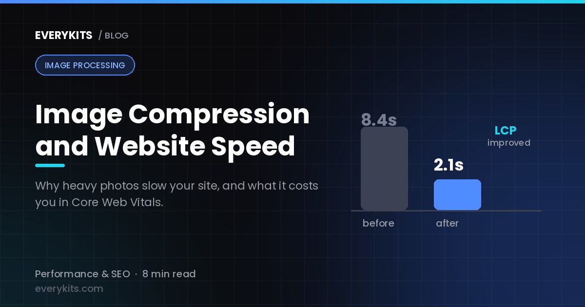
Image Compression and Website Speed: Why Your Photos Might Be Slowing Down Your Site
If your website feels sluggish, takes a few extra seconds to load, or visitors keep bouncing off before the page even finishes rendering, there's a good chance the culprit isn't your hosting plan or your code. It's your images. Large, uncompressed photos are one of the most common — and most overlooked — reasons websites load slowly, and the fix is often simpler than people expect.
Let's walk through exactly how images affect your site's speed, why that matters for both users and search engines, and what you can actually do about it.
How Large Images Slow Down Page Load Time
Every time someone opens your website, their browser has to download every single file on that page — the HTML, the CSS, the JavaScript, and yes, every image. Text and code files are usually tiny, often just a few kilobytes. Images, on the other hand, can easily be several megabytes each, especially if they came straight from a phone camera or a DSLR without any editing.
Here's the simple math: a single uncompressed photo from a modern smartphone can be 4-8 MB. If your homepage has five or six such images — a banner, some product shots, a few icons — you could be asking visitors to download 20-30 MB just to see one page. On a fast fiber connection, that might still load reasonably quickly. But most people aren't on fiber. They're on average home broadband, office Wi-Fi, or mobile data, where that same page could take 8-10 seconds or more to fully load.
And here's the thing about the internet: people are impatient. Study after study has shown that a large percentage of visitors will leave a page if it doesn't load within a few seconds. That's not a UX inconvenience — that's lost customers, lost readers, lost signups.
Image compression works by reducing the file size of these images, usually by removing data that the human eye barely notices, without dramatically changing how the image looks. A well-compressed image might go from 5 MB down to 400 KB while still looking essentially identical on screen. Multiply that saving across every image on your page, and you can cut your total page weight down dramatically, which directly translates to faster load times. Our deep dive on how image compression works behind the scenes explains exactly which data gets discarded and why you don't notice it.
It's also worth mentioning that this isn't just about the first load. Every returning visitor, every page they click through to, every product they browse — all of it involves loading more images. If those images are heavy, the slowness compounds across the entire browsing session, not just the homepage.
The Effect on Core Web Vitals and SEO Rankings
If you've spent any time reading about SEO, you've probably come across the term "Core Web Vitals." These are a set of specific, measurable signals that search engines use to judge how good the experience is on a webpage. Three of them matter especially for our topic:
Largest Contentful Paint (LCP) measures how long it takes for the biggest visible element on the page — often a hero image or banner — to fully load. If that image is heavy, your LCP score suffers immediately.
Cumulative Layout Shift (CLS) measures how much your page jumps around while it's loading. Unoptimized images without proper dimensions set can cause the page layout to shift as they load in, which is exactly the kind of thing that frustrates users and hurts this score.
Total page weight and load speed more broadly feed into overall performance metrics that search engines increasingly factor into how they rank pages, especially on mobile.
Search engines want to send their users to pages that provide a good experience, and a slow-loading, image-heavy page simply isn't that. Sites that pay attention to image optimization tend to see measurable improvements in their Core Web Vitals scores, and over time, that can translate into better visibility in search results. It's not the only ranking factor by any means, but it's one of the easier ones to control, and ignoring it is leaving an advantage on the table.
Why This Matters Even More for Mobile Users
Desktop users on a stable internet connection can sometimes get away with a heavier page. Mobile users usually can't.
Think about the conditions a typical mobile visitor is browsing under: a train commute with patchy signal, a coffee shop with congested Wi-Fi, a mobile data plan with limited speed depending on location and network load. Add to that the fact that mobile devices generally have less processing power than desktops, and decoding large images takes longer too.
Given that mobile traffic now makes up the majority of web browsing for most websites, optimizing images isn't a nice-to-have anymore — it's central to how most of your audience will actually experience your site. A page that loads in two seconds on your office desktop might take eight or nine seconds on someone's phone with a weak signal. That gap is almost entirely explained by unoptimized assets, images chief among them.
There's also a data cost angle that's easy to forget. Not everyone has unlimited mobile data. In many regions, people are conscious of how much data a website consumes, and a page full of bloated images can genuinely put people off returning, regardless of how good your content is.
What's the Ideal Image Size and Format for a Website?
There's no single perfect number that works for every situation, but there are some solid general guidelines.
Dimensions: Don't upload an image at 4000x3000 pixels if it's only going to display at 800x600 on the page. Resize images to the actual dimensions they'll appear at (or slightly larger for retina/high-DPI screens), rather than relying on CSS to shrink a huge file down visually — the browser still has to download the full-size file either way.
File size: As a rough target, most web images should sit somewhere between 100 KB and 300 KB after compression, depending on their complexity and how prominently they're displayed. A full-width hero banner might reasonably go a bit higher; a small thumbnail or icon should be far smaller.
Format choice:
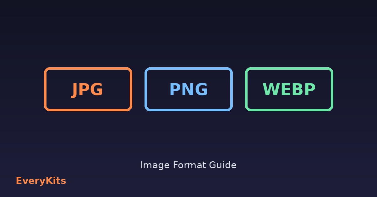
- JPEG remains a solid, widely-supported choice for photographs with lots of color and detail.
- PNG is better suited to images that need transparency or have sharp edges and flat colors, like logos or graphics — but it produces larger files for photos.
- WebP is a newer format supported by virtually all modern browsers now, and it typically produces smaller files than both JPEG and PNG at a similar visual quality. If your platform supports it, WebP is usually the smarter default.
Choosing the right format for the right type of image, combined with appropriate compression, usually gets you most of the way to a fast-loading page without any visible drop in quality. Our JPG vs PNG vs WebP guide covers the edge cases in more detail.
Measuring the Difference: Before and After
None of this is worth much if you can't see the actual impact, so it's worth running a simple before-and-after test.
Start by testing your current page speed using a free tool — there are several well-known ones that will give you a load time, a performance score, and a breakdown of what's slowing things down. Take note of the numbers, and pay particular attention to how much of the page weight is coming from images.
Then, compress the images on that page — resize them to their actual display dimensions, convert them to an efficient format like WebP where possible, and reduce the quality setting slightly (often you can drop quality to 70-80% with no visible difference to the human eye). The EveryKits image compressor handles this in the browser with no upload and no account, and our guide on compressing images without losing quality covers common causes to check before you re-compress. Re-upload the optimized versions and run the same speed test again.
The difference is usually dramatic. It's common to see load times cut by half or more, and performance scores jump significantly, just from this one change. Seeing that improvement firsthand is often what convinces people that image optimization deserves a permanent place in their workflow, rather than being a one-time cleanup task.
Making Image Optimization a Habit, Not a One-Time Fix
The real challenge isn't compressing images once — it's remembering to do it every single time you add new content to your site. A blog that gets updated weekly, a product catalog that's constantly growing, or a portfolio site with new work added regularly will all quietly accumulate bloated images over time if there's no consistent process in place.
The good news is that this doesn't have to be a manual chore. Plenty of straightforward online compression tools let you drag and drop images and get optimized versions back within seconds, without needing any design software or technical skill. Making it a standard step before uploading any image — the same way you'd proofread text before publishing it — is usually all it takes to keep your site consistently fast. If you're building out a wider workflow, our roundup of free online tools for bloggers covers where compression fits alongside the rest of the stack.
At the end of the day, a fast website isn't just a technical nicety. It's part of the experience you're offering every single visitor, and images are one of the biggest levers you have to make that experience better.
Comments
Comments coming soon! In the meantime, feel free to share your thoughts on social media.